Selected projects
Selected work.
A few examples of what we can do. Each one starts with a single idea and carries it all the way through, from the first screen to the footer.
Muay Thai coaching · Liverpool
SPYNX
- Sector
- Sport & fitness
- Year
- 2026
- Status
- In progress

The idea
Colour is earned.
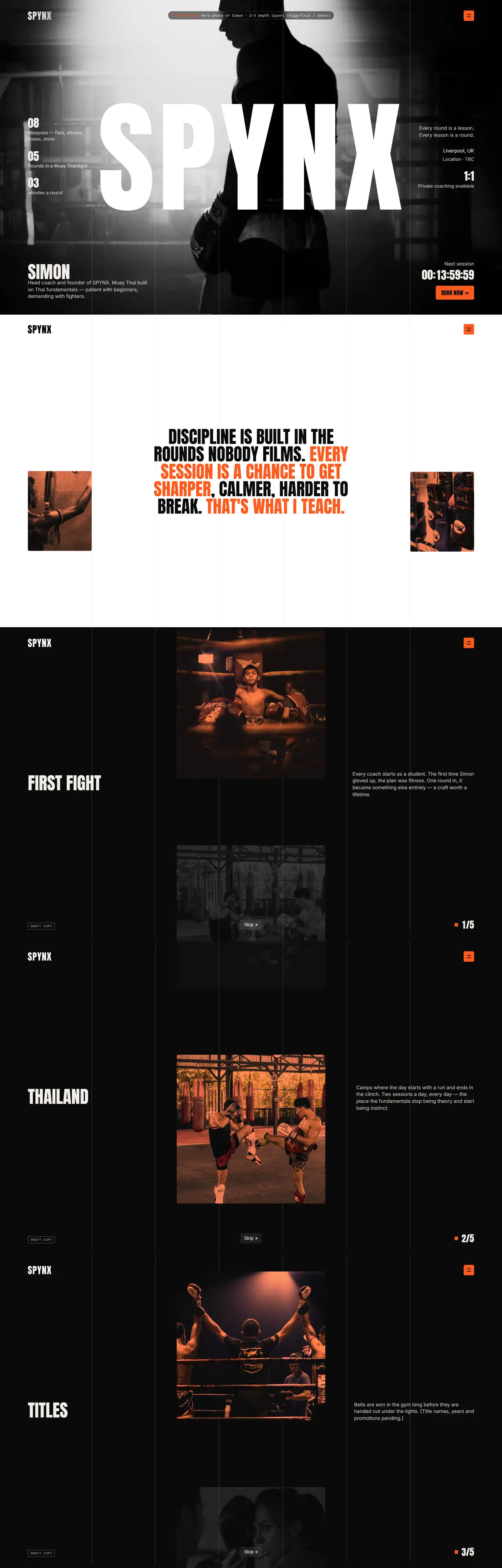
A landing page for Simon, a Muay Thai coach building his own brand. The whole site sits in black and white until you move, then orange bleeds through like heat coming off a pad. It sells the coach, the classes and the next session in one long, cinematic scroll.
Signature moments
- 01Colour you pour inMove over the hero and orange flows through Simon’s photo like liquid, wrapping around him before it fades.
- 02Count to 100The loader counts up, then the camera pulls back out of a single letter of the SPYNX wordmark into the hero.
- 03Next session clockA live countdown to the next class sits in the hero, so there is always a reason to book today.
- 04The gloveA 360° glove turns as you scroll, surrounded by students’ words.
Brand breakdown
Click a colour to copy it.
Why it works.
- 1
It feels like the sport
Heavy type, hard edges and black and white photography. People who train recognise themselves in it straight away.
- 2
Colour means something
Orange is rare, so every flash of it pulls the eye to what matters: book a session, the next class, the glove.
- 3
It sells the coach
Simon’s face, story and record lead the page, so new students know exactly who they will train with before they book.
Same-day van courier · Liverpool
Simple Solutions Couriers
- Sector
- Logistics
- Year
- 2026
- Status
- Built

The idea
The route.
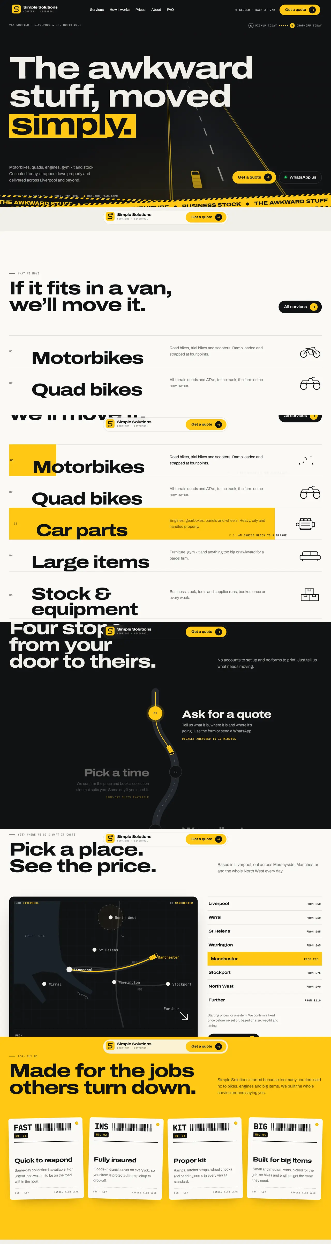
A rebuild of a quick draft site into a fast, branded home for a Liverpool courier. The logo is an S drawn as a road from pickup to drop-off and that one road runs through the whole website: the intro, the map, the prices and the footer.
Signature moments
- 01A to B introThe S route draws itself, a van drives it from pickup to drop-off and the homepage opens out of point B.
- 02Satnav pricingPick a town and the route draws out of Liverpool while the price rolls over to match.
- 03A live job ticketThe quote form fills in a delivery ticket as you answer, then sends it straight to WhatsApp.
- 04Parked upAt the bottom of every page the van pulls into its bay and the wordmark fills with yellow.
Brand breakdown
Click a colour to copy it.
Why it works.
- 1
One idea, everywhere
The road shows up in the logo, the intro, the map and the footer, so the brand sticks after a single visit.
- 2
Built for a quick booking
Clear prices, coverage and a WhatsApp quote mean a customer can get a price in under a minute.
- 3
Yellow means go
Kept for buttons and key moments, it reads like road markings and never fights the content.
Wedding, editorial and product photography · UK
Surma Studio
- Sector
- Photography
- Year
- 2026
- Status
- Built

The idea
A roll of film that flows like a river.
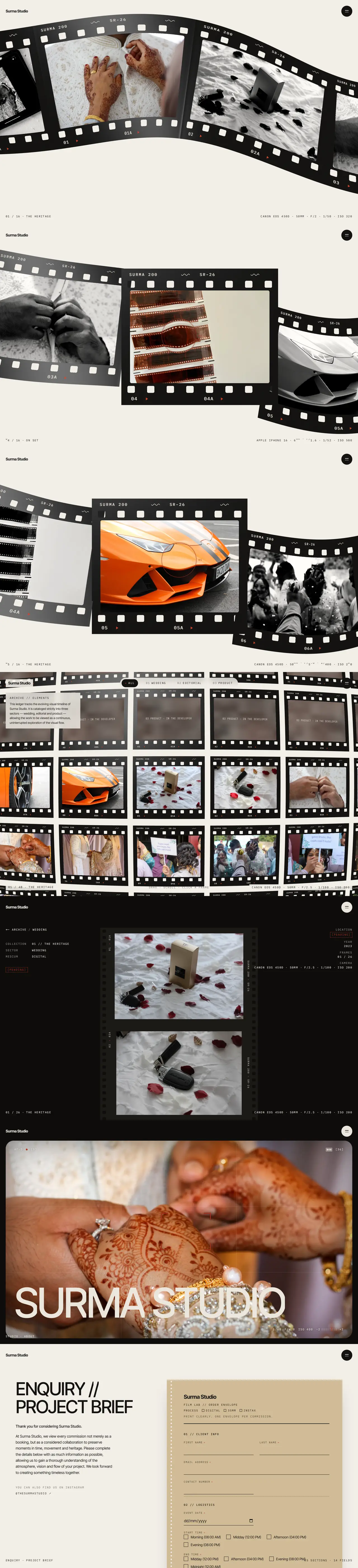
A new home for a photography studio named after the Surma River. Instead of a grid of photos, the work runs across the screen as one continuous strip of film that drifts like water and develops into colour as each frame reaches the middle.
Signature moments
- 01The film stripA 3D strip of frames bends through space. The centre frame develops from black and white into colour.
- 02DevelopingThe loader glows safelight red and the first photo appears as if it were sitting in the developer tray.
- 03Contact sheetEvery frame in one draggable sheet, marked up in red grease pencil when you filter by sector.
- 04Lab envelope enquiryThe booking form is laid out like a film lab envelope, with every detail a photographer needs.
Brand breakdown
Click a colour to copy it.
Why it works.
- 1
The photos come first
Everything around them is quiet paper and ink, so the work carries the page.
- 2
It tells their story
Film, the river and the darkroom are real parts of how Surma works. The site turns them into something you can touch.
- 3
Empty becomes intriguing
Sectors still being shot show as frames in the developer, so a growing studio looks deliberate while the archive fills up.
SIA security training · UK
Learning and Employment UK
- Sector
- Education
- Year
- 2026
- Status
- Concept

The idea
From first booking to a paid role.
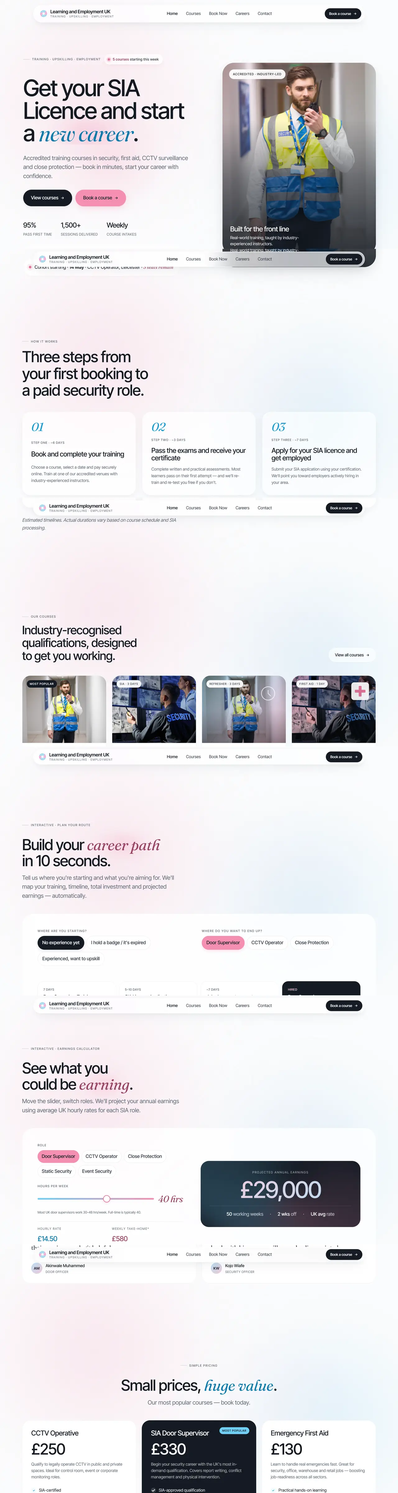
A redesign concept for an accredited security training provider. It shows people the whole journey, from booking a course to the job and the money at the end of it, then makes booking feel simple.
Signature moments
- 01Career path in 10 secondsPick where you are now and the role you want and the site maps the courses, timeline and cost.
- 02Earnings calculatorSlide the hours and switch roles to see what you could earn a year in that job.
- 03Three stepsBook, pass and apply. The whole process on one line, so nobody feels lost.
- 04Honest pricesCourse prices sit on the page with what’s included, no phone call needed.
Brand breakdown
Click a colour to copy it.
Why it works.
- 1
It sells the outcome
People buy a course to get a job. Showing the job and the wage first gives them a reason to book.
- 2
The brand, grown up
The blue and pink come straight from their logo, softened into gentle gradients so it feels premium and calm.
- 3
Tools that help
The planner and calculator answer the questions people would otherwise phone about.
A painted record of Somali stone architecture · UK
Dhagax
- Sector
- Art & heritage
- Year
- 2026
- Status
- Private preview

The idea
Stone, remembered.
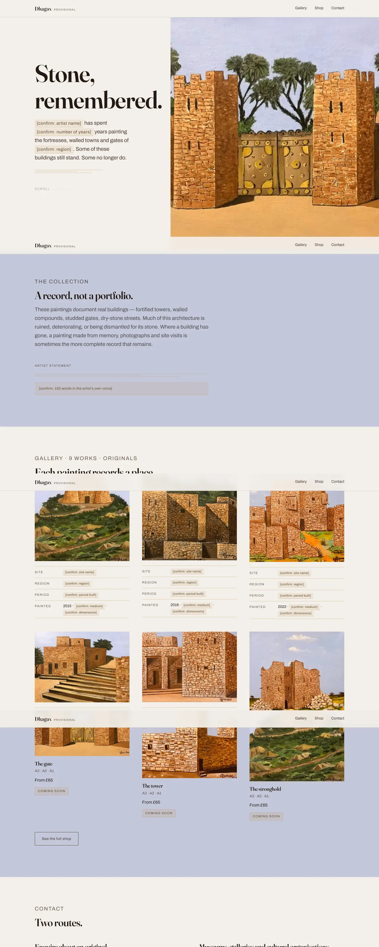
A home for a series of paintings of Somali stone buildings: forts, gateways and walled compounds. The site treats each painting like a museum piece, with room to look closely and space for the story of each place.
Signature moments
- 01The paintings leadLarge, calm layouts give each painting the room it would get on a gallery wall.
- 02A record of each placeEvery work has space for the site, the region, when it was built and what remains.
- 03Colour from the canvasThe palette is pulled from the paintings themselves: limestone walls, brass studs and lavender skies.
- 04Ready to growBuilt so the collection can add a shop and more works without starting again.
Brand breakdown
Click a colour to copy it.
Why it works.
- 1
Respect for the subject
Quiet design lets the heritage speak. Nothing competes with the paintings.
- 2
Colour that belongs
Every colour on the site already exists in the artwork, so the whole thing feels of a piece.
- 3
Stories over specs
Each painting is framed as a place with a history, which is what makes people stay and share.
Your project could be next.
Start a projectOr skip ahead — start a project